Semantically driven

  • Home
  • About
    • Privacy policy
    • Archives
      • Reviews & Giveaways
  • Photography
    • Project 365
  • Contact me
You are here: Home / Archives for Digital content

A trip down memory lane

July 22, 2014 by Jen

My son and I love watching movies together and now he’s a bit older there are more options. We watched the first Mission Impossible film recently. It was made in 1996 – nearly 20 years ago.

During part of the film, Tom Cruise’s character, Ethan Hawke, sits down at his laptop and opens a web browser – Netscape. Netscape was pre Firefox and even Internet Explorer I think. Mosaic and Netscape were two of the first web browsers I remember around that time – mid 1990s.

He also searched for information via Listservs – electronic mailing lists. You could join a listserv on a topic of interest and get emails, either individual or digests, from other members of that listserv. It was a very early social media. When I was at uni, I remember studying a Melrose Place listserv as an ethnographic study for a subject I was doing. I loved being able to combine my interests of television, writing and technology. And people were really passionate about Melrose Place which made reading their posts to the Melrose Place listserv very fascinating. You could watch it in a city pub on a Tuesday night along with the other Melrose Place tragics.

It was also around this time that I taught myself HTML so I could create webpages. There were no WYSIWYG software packages around then so if you wanted to create a webpage you had to know HTML. I’m glad I did because knowing the code serves me well now when I need to tidy things up a bit.  I could see that web content had the potential to be massive. And while web content has expanded so have web technologies. Using a hand-held device was something that was done in science fiction, not for real.

Web content marketing or web content strategy wasn’t a twinkle in anyone’s eye yet. My workplace at the time created a website for the organisation and it was very internally focused and it was a long scrolling page with no graphics. It couldn’t link off to different services we offered in more depth because other areas hadn’t jumped on board yet. I lobbied to get our department a website and after a while it eventually happened. I created the site, a graphic designer did some graphics and an editor helped shape the words. Each page was standalone so if a header or footer changed you had to do it on all the pages. Luckily there weren’t many pages.

We had no web guidelines or standards so it was do what you want pretty much. The IT department owned the website and its content and it stayed like this for a number of years until marketing took it over the web content side of things. Since then I’ve been in both departments in different organisations where web content is managed.

Now updating web content is a heck of a lot easier – although it depends on what content management system is being used. One I’m using at the moment is outdated and not supported any more so some things take a long time to do.

What’s still lacking in many cases is a focus on content. If I had a dollar for every time someone in a meeting mentioned how a website could look over focusing on content in detail, I could retire now. Yes, it takes time to get content together, to shape it and put it together in a meaningful way, but that’s why people visit websites, for the content.
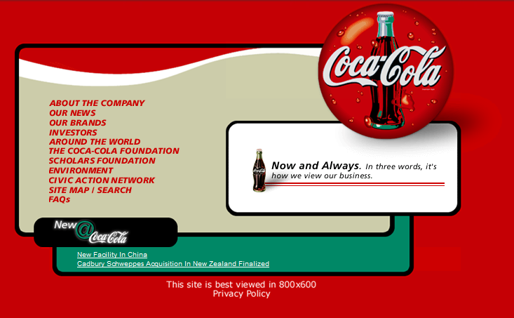
Coca-cola website, 1990s

Have a look at Coke’s website in the 1990s (above).

Remember how many websites used to tell us how best to view them? Remember how many screens – and we’re talking desktops here – had screen resolutions of 800 x 600?

coca-cola-2014

Coca-cola refreshed their website late last year to be more of a storytelling device rather than a corporate website. In fact they said that “Content is king and the corporate website is dead“.

Their new website is certainly much more engaging than the earlier efforts and the refresh involved asking their audience what they liked, and checking metrics about what was being viewed and shared.

I’d like to know how it’s faring now and what they are doing with it moving forward. It’s certainly come a long way, just like the Mission Impossible films. Comparing the first to the last Mission Impossible films – 15 years difference between them – you can see how far technology and special effects have advanced.

What do you remember from earlier web creation days that you’re glad has changed?

Submit to StumbleUponShare on Tumblr Share

Good web content means more visitors to your website

June 18, 2014 by Jen

Lost

I recently published a website at work and a month or two later checked in to see how it was going. Comparing the analytics to the same time last year was very pleasing. Visits to the main page, and some others, had quadrupled, and visits to other pages were up by a healthy amount as well.

So what changed to get these results?

Without going into specifics the website was for particular cohort of external visitors wanting to find information about studying. The main downfall of the previous website was that to get to it you had to click on the link to the office that managed the applications, not the task of what people wanted to do, or what they might be searching for.

Therefore it wasn’t immediately obvious to users as they browsed from the homepage, and they were missing out on natural search engine results as well.

Also, because the information that the users might be looking for was within this Office’s website, it was a bit buried.

In addition, once you got there it wasn’t really clear what the process was a future student might need to undertake to find a study area, see if they were eligible, and how to apply.

To kick things off with this group, we got together and I presented an issues and suggestions document. I described the issues as I’d found them, and researched, and offered solutions to make it more user-friendly and easier to navigate.

I then got the okay to create a new draft website, and after a few revisions, got content sign-off. That all makes it sound easier and quicker than it was. I was expecting some pushback but everyone thought that what I suggested made sense.

For the website itself, I created a completely new site in a draft area on the web server. That way it’s much easier for stakeholders to visualise how the information architecture has changed. I had to answer some questions of how the new navigation to get to this website would work, and what links would change on the website of the Office concerned and did that via screengrabs and text updates in Word.

It’s a common theme for when I’m doing web updates for many groups that there is still a sense that web content is structured around an organisational structure because that’s how we see ourselves as employees within an organisation. We often want to make our department have a profile, and use the name of that department whenever possible. This is rife in government organisations too.

It’s not just me who experiences this. My mentor (although he doesn’t know it), Paul Boag, talks and writes about this a lot. One of his latest posts talks about The Guardian newspaper updating their website and says that your organisation has to adapt to the user. So true.

As I say to colleagues that don’t quite get it yet. Think about if you’re new to an organisation. Do you know the internal organisational structure? Will you know to search for a department’s name to find the information you want, or will you search for the topic you want?

The stats prove it. The web stats I produced after my web update prove that focusing on the user is working. It would be good to see if that translates into more applications for study, but that’s another thing.


Submit to StumbleUponShare on Tumblr Share

Jottar – create your online memoir

May 16, 2014 by Jen

jottar - create your own memoir onlineWhen my son was born I was given one of those ‘My First Year’ books that I recorded all of his details and certain milestones. I recorded when he was born, I pasted in the birth notice from the paper, his wrist band from the hospital. I’ve noted when he got his first tooth, when he first started walking, why I called him what I did. I’ll give it to him one day – maybe when he has kids of his own so he can appreciate it.
Now there’s an online equivalent – Jottar.

Jottar was created to write your memoirs and to record and share great memories.

Have you ever tried to recall the date you went on an overseas trip?, Where you lived when you were a kid?, What your grades were for a specific year in school?, What you were doing to celebrate the new millennium?, Do you have a box full of diaries that have built up over the years?

Well this is where you can treat Jottar as your online diary and store these memories. In your ‘Storyboard’ you can add memories from your childhood, teenage years or adulthood. You can add documents, photos and notes to each post. Not only can you record past events but also create future events and invite friends and family to them.

You can choose to stay private or share certain occasions, experiences and events with others.

I also think it’s a great resource to replace, or in addition to, the My First Year book – and the rest.

I’ve always struggled to know what to do with his paintings and craft he was always bringing home from kindergarten and school. Why not digitise it and add it to Jottar? That way your child/children already have an account of their artwork and their special events so far in their life. And when they’re old enough you can hand over the reins so they can continue.

So far I’ve kept all my son’s memoirs private but you can make them public or share with your friends. I’ve heard of quite a few people start a blog to keep their family and friends up to date with their kids progress and this is another alternative.

There’s more to Jottar than recording your child’s first years though. Use it for your memories and you can even write a letter to your future self.

I know about Jottar because my clever friend has recently built it. I think he’s on to a winner. If you’ve got any feedback on using it you can contact him via the form on the site. I’m sure he’d love to hear it – both good and constructive feedback.

Go forth and create your memoir.

Submit to StumbleUponShare on Tumblr Share

Tips for email marketing

February 24, 2014 by Jen

Email is the most used form of digital communication and can be a very effective marketing tool. Below are some tips to help get your email opened and acted upon.

Consider why you’re sending the email in the first place

Don’t waste people’s time, or yours, by sending something that’s not valuable or helpful.

Why are you sending the email? This will inform your call to action (see below).

Use a descriptive subject line

This is the first thing that people usually see so make it descriptive. Maybe you can personalise it by including a first name. Make sure you have all the first names in your database if you do this though.

Think about the lists you subscribe to. What makes you want to open an email?

DON’T use the same subject line for each regular email you send. I get a regular email newsletter and the subject line is always the same. There’s nothing there to entice me to open it. I don’t care to read ‘what’s on’, I’d rather have a taste of what is actually on.

Email content and design

  1. Keep it short.  Think back to the purpose of the email and don’t stray from that. Remember many people will view on their mobile phone. Campaign Monitor have tips about designing for mobile.
  2. Remember people reading online scan content. Use headings and lists to break up the content.
  3. Put the most important content at the top.
  4. Write the email as if you’re talking to one person. Use ‘you’.
  5. Use images but remember that many email clients block images automatically so they may not be seen.
  6. You can’t use Flash animation.

Include a call to action

What do you want people to do after reading your email?

  • Do they need to register for an event?
  • Do they need to read further information on your website? Linking through to further info on the website is a way of keeping email shorter too.

After the email is sent

Look at the stats of the email program you used.

  • What’s the open rate?
  • What’s the click-through rate?
  • Did you have undelivered emails? If so, clean up your database.

Mailchimp have some email benchmarking stats per industry.

Some examples

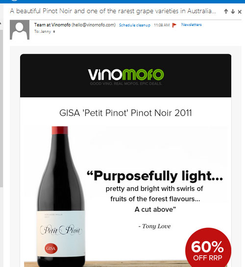
Two of the examples below have good subject lines – ie informative.

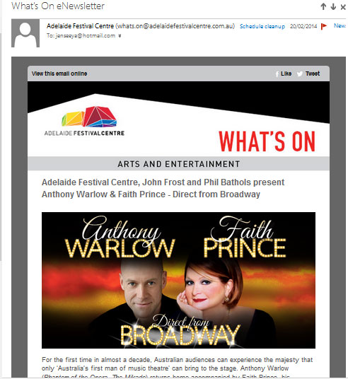
One of the emails below has an intro para with links to the website, but it’s probably unnecessary as that content is further down the email anyway. I think you could do away with the intro para and get straight into the actual content.

One of the emails has an informative subject line and gets straight into the call to action.

Which one’s your favourite?

raanews

festivalcentrenews

vinomofonews

Submit to StumbleUponShare on Tumblr Share

Animated gifs – yay or nay?

November 21, 2013 by Jen

If you had asked me 15 years ago if using animated gifs was a good idea I would have said an emphatic NO!

If you weren’t using the web that long ago, here’s a reminder of how they looked back then.

Remember the ‘Under construction’, and the famous dancing baby?

construction dancingbaby

Best forgotten. They were pretty primitive – although the dancing baby was kinda interesting. Another overused animated gif was the flashing *NEW* for when you added new content.

Here’s a page full of them just in case you need to see more.

Here’s the history of the animated gif.

If you watched the video you’ll already know that the animated gif made a resurgence in the last few years, especially on Tumblr, and more tools were available to create animated gifs.

Arty animated gif

Courtesy of Ozneo Tumblr.

If you want to create your own animated gif then there’s heaps of mobile and desktop apps.

I love the animated gif to make a point about a tv show or movie that isn’t as easy to get across in a still photo. It might be a series of animated gifs, or just one. Or they’ve become a bit of an artform as in the one above. Do you know the TV show it’s referencing?

Don’t forget if you add an animated gif into your website, like all images, add alt text for web accessibility purposes. But think about the purpose of it in the first place. The gif above is starting to do my head in so for me it would really depend on the type of content I’m posting, and the message I’m trying to convey.

But to the pronunciation of gif, ie jif and gif? I’m a gif girl (with the hard g sound). How about you?

Submit to StumbleUponShare on Tumblr Share

Why you shouldn’t simultaneously update Twitter from Facebook

November 10, 2013 by Jen

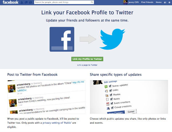
unlink facebook and twitter

Twitter and Facebook are two totally different social media platforms yet there’s one thing about people trying to integrate their social media updates on both these platforms that’s really annoying to me.

Facebook has the ability to automatically post your status update to Twitter. That’s great right? You only have to do one update and it’s done on two of your platforms. No, it’s not great, and here’s why.

Facebook will allow longer status updates, and Twitter, as you probably know, only allows 140 characters. Therefore when you automatically send your Facebook update to Twitter, it truncates and adds a web address, like the below.

The clue that if you click on the link and you’ll be sent to Facebook is the fb.me part of the web address.

Many people do automatic posting to Twitter from Facebook for their brand page because the Facebook updates have to be public to allow Twitter users to be able to see them.

The other Twitter statuses I’ve seen have been along the lines of “Like if you …….”. I can’t like your Twitter status. I can maybe favorite it, but ‘Like’ is a Facebook thing. I’m more likely to unfollow than anything.

Because of the difference between how the platforms operate you’re really much better off posting to them separately. You have to monitor both platforms anyway right? Right? I hope you’re doing that. There’s nothing more frustrating for a follower engaging with you to be ignored.

But maybe you don’t know how to disconnect the two. It’s easy.

How to revoke access between Twitter and Facebook

Go to Twitter, select your profile’s Settings. Click on Apps and Revoke access to Facebook. It’s easy. You might want to check out what else is connected to Twitter and do a spring clean while you’re there. Go and check. I’ll wait.

If you want to check what Facebook is posting to Twitter, check it out at www.facebook.com/twitter. You can unlink Twitter from here as well.

Other platforms can work well when posting to Twitter, like FourSquare and Instagram, just not Facebook.

But that’s my opinion. What’s yours?

Submit to StumbleUponShare on Tumblr Share

Are you responsive?

November 5, 2013 by Jen

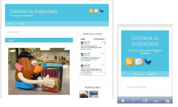
responsive web design for content is

It’s no secret that mobile devices like phones and tablets are used a lot more to view websites and to do tasks like shopping and banking.

At a recent comedy event, Catch of the Day co-founder Leibovich saw some strangers in front of him use the Catch of the Day app on their phones. I’m guessing it was something these people probably wouldn’t have done otherwise, but because they had a bit of time while waiting for the show to start they got onto it.

I’ve installed my bank’s app on my phone so I can pay bills and check my balance using my phone if I wish. It can be very handy and is quicker and easier to use sometimes rather than my desktop computer or laptop where I have to dig out my customer number to login.

Using an app from my iPhone is fine because it’s built for the device but viewing a website that’s not built for a mobile device can be a very frustrating exercise in scrolling and zooming around the place to try and find the information I’m after.

When I created this blog I paid for a premium Studiopress WordPress theme. I’ve been using free themes for years on other websites but I thought I’d pay for one this time.

Unfortunately my knowledge of responsive web design wasn’t at top of mind when I purchased my theme and it wasn’t responsive. Responsive just means that it will look good when viewed on a desktop computer as well as a tablet and as well as a phone. But they’ve recently released an update which I’ve applied here so it is now responsive. The banner is a bit boring but all the content is there and it looks good on my phone and on my computer so I’m happy. And once I’ve got a bit of time I can tweak the banner anyway.

I’ll also do a bit of tweaking with the CSS as I’m not mad keen on the fonts but that’s easy to change.

Here’s a bit more about what responsive design is and techniques for achieving it.

Here’s some lovely examples of responsive web design.

How about your website. Is it responsive?

Submit to StumbleUponShare on Tumblr Share
Next Page »

Popular posts

  • Making tomboy stitch
  • She’s crazy like a fool. What about it Daddy Cool?
  • What my life could have been like in the 1970s in Canberra
  • Big Brother 2008 – live blogging launch night
  • Damn mosquitos
  • The double space and the title case
  • Not all beer and skittles
  • Documenting the build of Lego
  • Making vodka jelly
  • Twitter and Plurk get Pinged

Looking for something?

Categories

My photos

Copyright © 2022 · Beautiful Pro Theme on Genesis Framework · WordPress · Log in